Where's your head at?
Noodl
WHAT WE DID
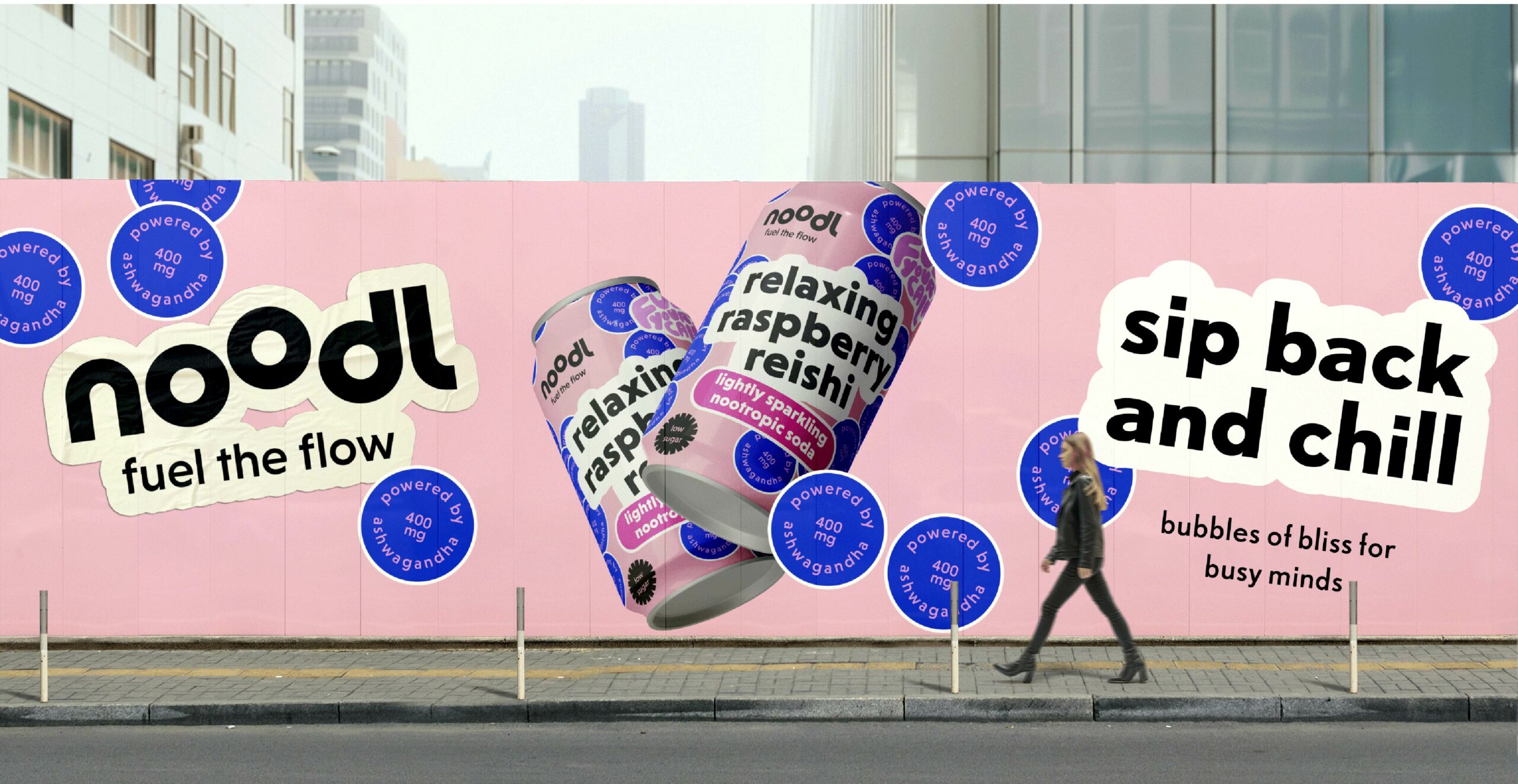
Category audit & positioning | Naming | Pack concept & Pack hierachy | OOH concept | Rollout into social
WHY WE DID IT
Noodl’s journey from concept to shelf began with a challenge: how do you stand out in the crowded world of functional sodas? With the market brimming with options—caffeine, matcha, L-Theanine, and CBD all vying for attention—we knew our approach had to be more than just aesthetic. It needed to cut through the noise, resonate with consumers, and introduce the power of functional mushrooms in a way that felt both fresh and authentic.
The Challenge
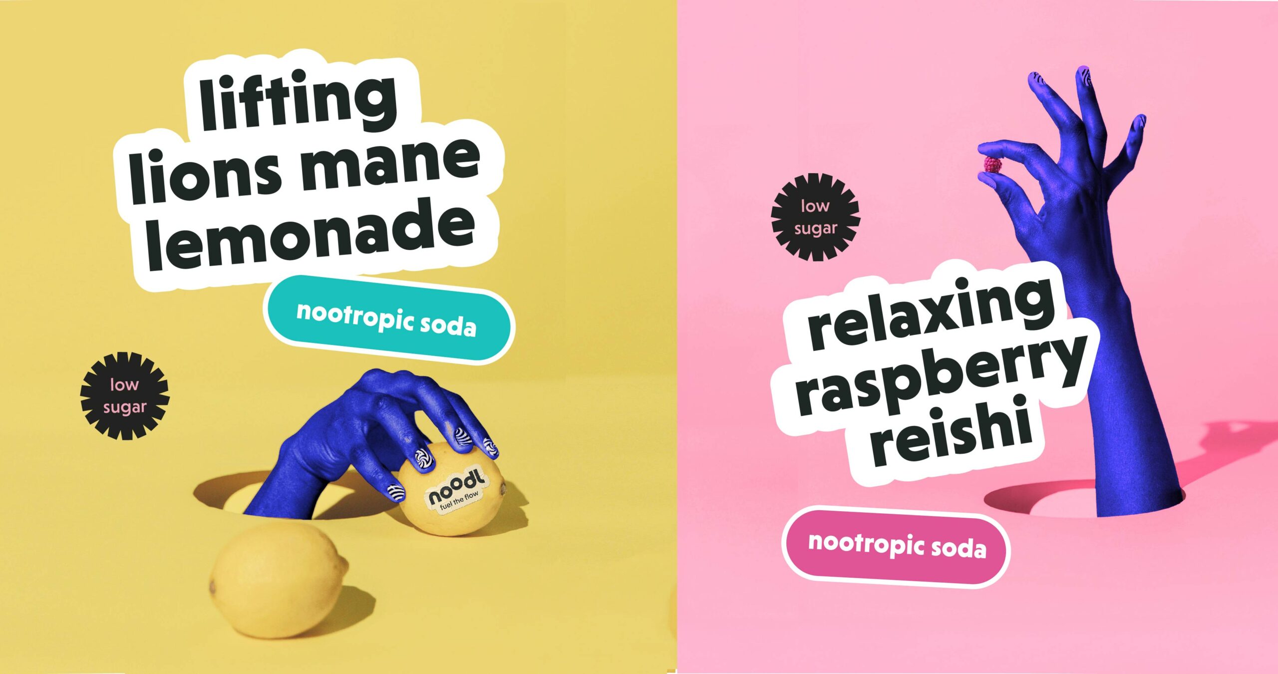
We wanted to introduce the magic of mushrooms to the functional soda category, attracting a millennial and Gen Z audience with a product that feels like a treat and works like a charm. We knew that taste had to come first as the primary purchase driver - but we didn't want to lose the all-important function of ingredients like Lion's mane and Reishi which balance busy minds, supporting focus and sleep.
The Approach
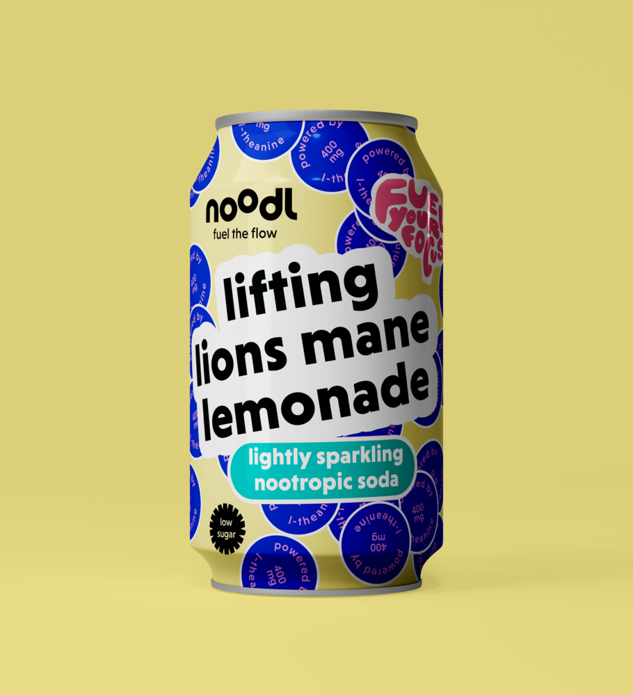
Our positioning had to transcend mere visuals. We were up against not just established brands, but also consumer scepticism about misleading claims. Our mission? To make terms like ‘nootropic’ accessible to a broader audience while simultaneously conveying that Noodl is the refreshing pick-me-up they’ve been craving. To achieve this, we embraced a dynamic sticker aesthetic—a playful and distinctive brand asset that features a spray of stickers across the design. This not only communicates key ingredients and functions but also captures the excitement and anticipation of that perfect moment when you pop open a can.
The Outcome
The result is a design that not only captures attention on the shelf but also serves as a springboard for endless communication touchpoints. In the true spirit of Noodl’s brand purpose, it creates an unexpected and creative consumer experience, no matter where it lands.

