A Taste of New Orleans
Blue Plate
What we did
Strategic direction, packaging redesign, consumer testing setup, illustration, creative direction, pack hierarchy and messaging.
Graphic design and illustration showcased in this case study in collaboration with Zeynep Başay at Pata Studio, an award-winning designer and illustrator we love working with.
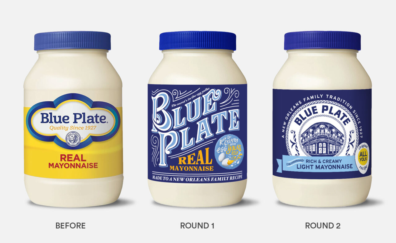
How it went
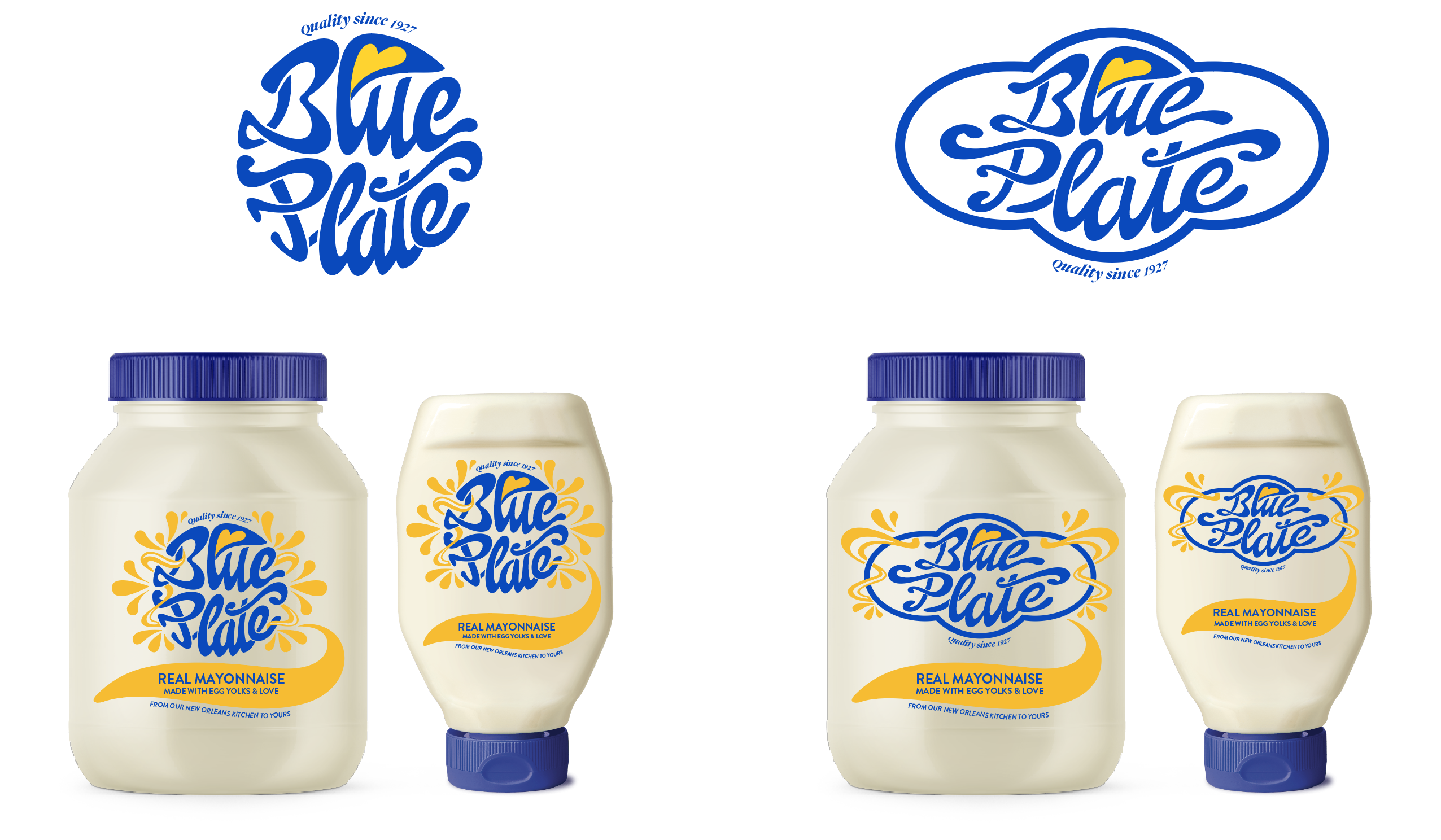
Partnering with consumer testing agency Smashbrand we tested nearly 30 variations of a new pack design against both challenger brand Dukes, and Blue Plate’s existing design. Zeynep Başay winning design on both premiumness and authenticity is showcased here, with the final variation adapted to align with stylistic preferences.
The Brief
In a crowded category, we had to give shoppers a reason to walk away from their default choice of mayo and try Blue Plate. To do this, we had to show that Blue Plate is the mayo you’ve got to try. It’s a New Orleans heritage brand –a place where good food is a given – and because it’s made with egg yolks only, it’s full of hearty flavour. To win over consumers who would automatically reach for the market leader, we created an arresting on-shelf experience that bursts with the flavorful essence of this heritage brand. Blue Plate isn't your average mayo, it's an authentic New Orleans experience without leaving the front door.
The approach
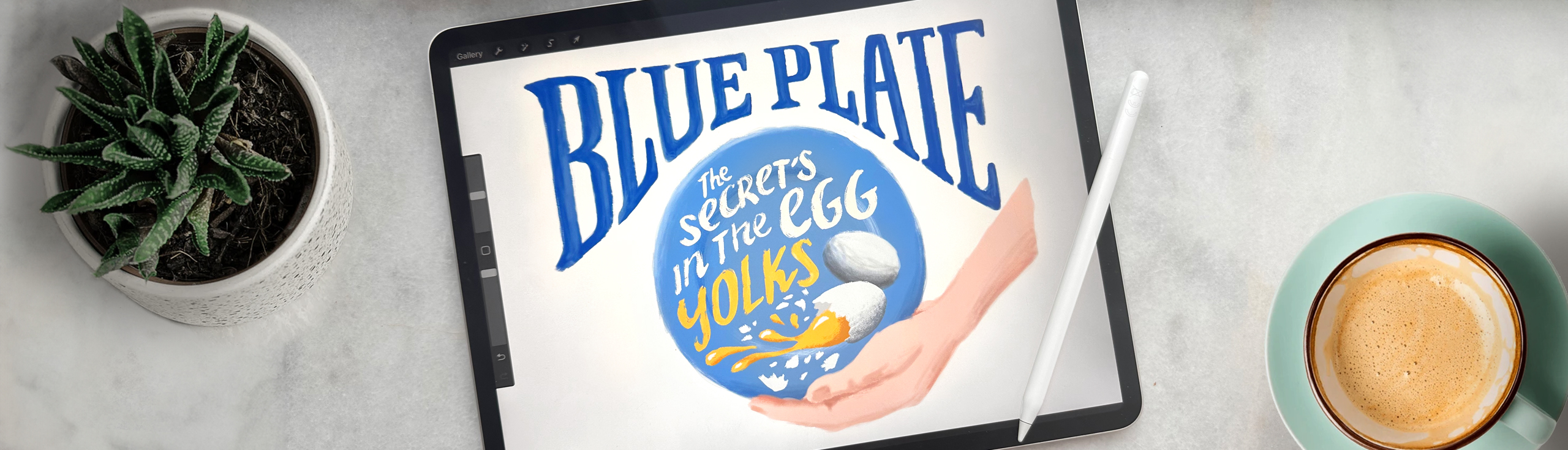
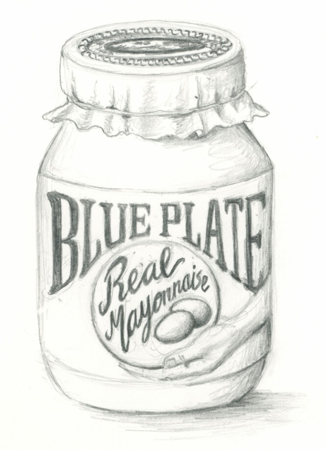
Inspired by antique typography, a hand lettered and hand illustrated route exudes ‘Blue Plate is quality’ through a high level of artistry and heart, disrupting shopper attention with a burst of nostalgia that speaks to Blue Plate’s staple New Orleans status – first by showing, then by explaining. Real Mayonnaise says what it is – choosing clarity over cleverness. Detail draws you into the experience: ‘made to a New Orleans family recipe’ forms a tertiary callout benefit. While ‘Rich and creamy egg yolks’ is integrated seamlessly into the style of the design – with freshly cracked eggs illustrated to give a feeling of homemade and to add the vibrancy and energy of a meal about to be made. Scroll down to see our design in progress from scamp to final execution.
The Outcome
The execution of a distinct blue label evolved through rounds of testing, ultimately winning on distinctiveness against regional competitor Duke's and existing packaging. Purchase intent among growth audiences was highest with the hand-drawn concept, while existing Blue Plate fans preferred a design closer to the market leader. The final design bridged both preferences, striking a balance that leveraged heritage while updating the brand for modern times – and tastes.