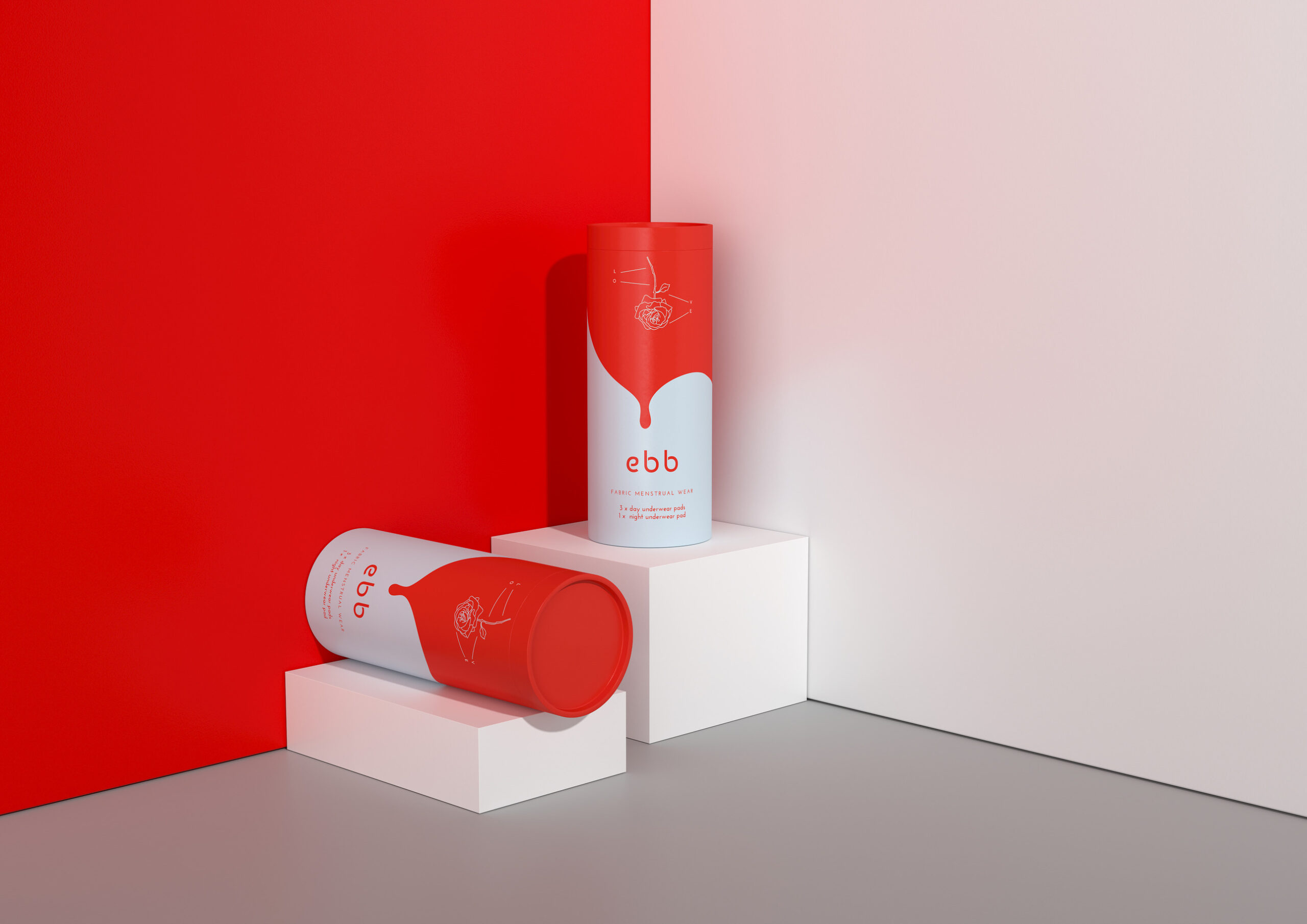
Packaging That Bleeds Boldly
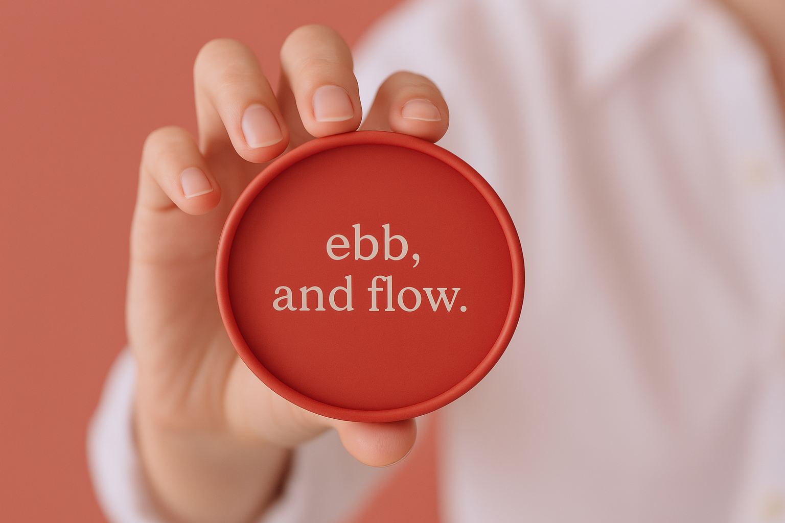
Ebb
The top line
A fearless menstrual brand rooted in dignity, not discretion.
The team
We crafted drand strategy, design, naming, packaging design and copywriting, along with pormotional 3D renders. Kieran Katwala & Siena Dexter on words and concept, Olivia Goodenough on brand illustration and Katinka Donagemma on 3D visuals.
The Challenge
In many parts of the world, menstruation is still whispered about, hidden away, or outright ignored. Binti, a charity committed to menstrual dignity and education in India, was ready to challenge that. As part of their mission, they were launching a not-for-profit range of reusable menstrual wear, a product designed not just to serve a need, but to spark a conversation. Our role? Create packaging that didn't shy away from the realities of menstruation. It needed to be honest. It needed to be beautiful. And above all, it needed to be brave.

The Approach
We chose not to conceal blood. We celebrated it. Inspired by the natural rhythm of the body, the design embraces rich, flowing reds and abstract patterns that evoke movement, vitality and life. Instead of opting for soft pastels or euphemisms, the aesthetic leaned into symbolism that says: this is normal, this is powerful, this is human. Designed pro bono, the project channels cultural respect with a modern edge, helping flip the narrative from shame to pride. In a market where silence is the norm, Ebb was made to speak up.
The Outcome
The result was more than packaging. It became a statement. Ebb helped visualise Binti’s mission in a single glance, turning a functional object into a tool for awareness and dignity. The range launched with a warm reception, sparking conversations around menstrual health, particularly in regions where such discussions are still culturally difficult. And while profits weren’t part of the plan, impact was. Every pack distributed through the campaign carried not just product, but purpose. Design can change minds. It can reframe stigma. Ebb proves that when we stop hiding the truth, we start making progress.